How to Color Calibrate LCD Monitor Prints with Calibrize 2.0 . Software
- Cách Hay Nhất
- Jun 17, 2021
- 3 min read
Beautiful, realistic colors are one of the biggest desires when using LCD, especially for graphic designers and movie lovers. But even with a high-end LCD screen, the parameters of color, brightness, and contrast when shipped are not the best.
For designers or printers, the color displayed on the screen with the same printed color is extremely important.
In order for the monitor to display the most realistic image, you must perform an important fine-tuning process called “Calibrate” to find the optimal parameters for the screen. This stage requires the use of expensive specialized equipment and is very rare in Vietnam.

However, you can also perform “Calibrate” quite easily with very good quality using the software Calibrize. Just patiently tweaking, you will be completely satisfied with the color quality that the LCD brings. Download Calibrize for free here:
Install the software calibrize
- Install the downloaded calibrize software and press "next"

- Click "next" to go to the next step

- Click "next" to go to the next step

- Click "next" to go to the next step

How to calibrate color
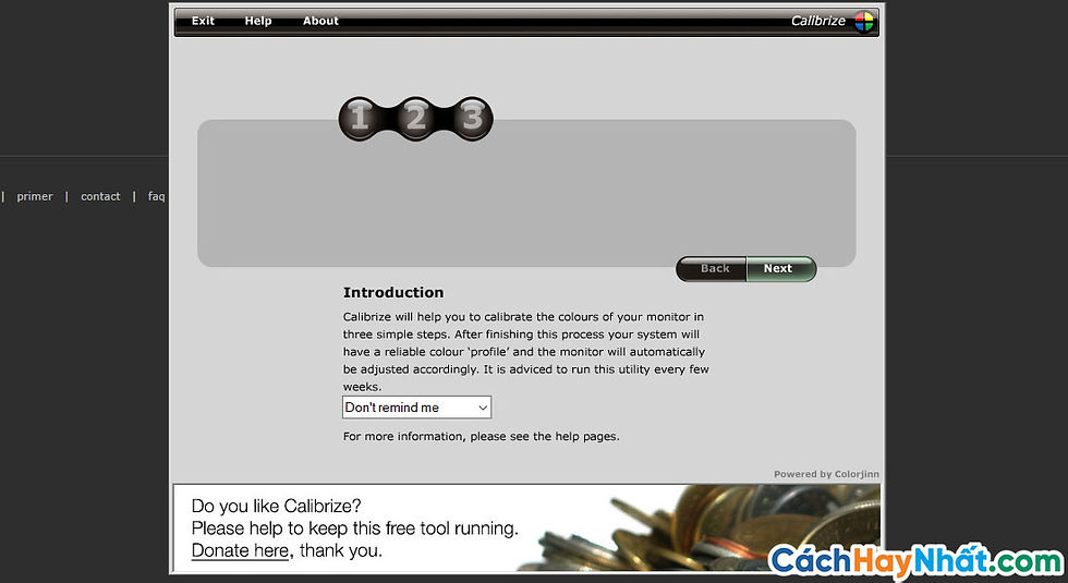
Step 1: Launch the program, click Next to switch to adjusting the brightness and contrast for the screen:

Step 2: You will see 2 cells with white and black background colors with a gray circle in the middle. Your task is to adjust so that the gray circle is clearly visible on 2 black and white backgrounds, then it will ensure that the brightness and contrast of the screen is harmonious and pleasant. To do so, you use the custom buttons of the screen, navigate to the Brightness and Contrast section and then increase the contrast to the highest, customize the brightness so that the image is clearly visible. Gray circle on black background. Then gradually reduce the contrast to clearly see the gray circle next to the white background box.

The calibration experience is that often the circle on the white background is often not as clear as the black background, but it should not be too blurry. You try to open a text file and then you can increase or decrease the brightness and contrast a bit until it is pleasant to see, not too bright and not too contrasting. When satisfied, click Next to move to step 3.
Step 3: Calibrate the colors for the most realistic display of the image. In this step, you will see 3 cells with red, blue, and green backgrounds (the 3 primary colors of LCD screens) with circles in the middle and an adjustment slider at the bottom. Your task is to move the slider at the sides to increase or decrease so that the color in the circle is the most similar to the outer background (ie not darker and lighter).

Để cân chỉnh nhanh và chính xác, ban đầu bạn kéo thanh trược về 2 phía (ứng với min và max) để xem màu sắc sẽ thay đổi như thế nào, sau đó đưa thanh trượt về tận cùng bên trái rồi kéo dần sang bên phải cho đên khi thấy màu bên trong hình tròn giống như nền bên ngoài. Khi này, dường như hình tròn biến mất, chỉ còn vài vạch đen nhàn nhạt. Bạn có mở vài trang web, file văn bản, một một bức hình quen thuộc (nên dùng loại phân giải cao, nhiều màu đan xen) đối chiếu màu sắc sao cho tự nhiên và ưng ý nhất. Chú ý là sau khi chỉnh xong màu sắc thì độ sáng, tương phản không còn chuẩn nữa, bạn nhấn Back quay lại bước một chỉnh thêm chút ít cho thật chuẩn.
Khi đã thấy ưng mắt, nhấn Next để sang bước 4
Step 4: Click Save to save.

So Best Way has taught you how to calibrate the screen color so that it is most accurate when printing, of course, it still depends on the quality of your screen.
Hope everyone can make beautiful photos when they print them out!


Comments